Playing with images in CSS
Table of Contents
How to deal with your images in CSS that are very difficult to control, ranging from improper proportions, improper image position, svg and so on.
Object Fit #
Object Fit sets how the image proportions are displayed if it exceeds/decreases its container. The default value is fill and the remaining 4 will discussed below.
There are 5 object-fit values: fill, contain, cover, scale-down, and none.

Cover #
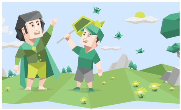
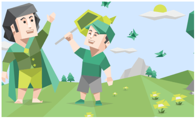
Maintains the aspect ratio of the image, but also follows the width and height of the container. So if the image is larger than the container, the image will be cropped while maintaining the aspect ratio.
<style>
  .box {
    margin: 0 auto;
    width: 500px;
    height: 300px;
    background-color: rgb(211, 232, 255);
    display: flex;
  }

  .image {
    width: 100%;
    height: 100%;
    object-fit: cover;
  }
</style>
<body>
  <div class="box">
    <img class="image" src="assets/mbti-5.png" alt="IMG">
  </div>
</body>
Contain #
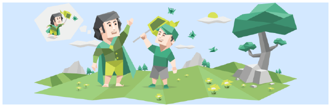
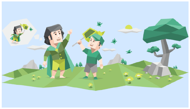
Preserves the aspect ratio of the image, but at the same time makes the entire image fit inside the container. So no matter how the container is enlarged/reduced, the image will always be proportional and inside the container with all its content.
<style>
  .box {
    margin: 0 auto;
    /* Adjust freely */
    width: 500px;
    height: 300px;
    /* Adjust freely */
    background-color: rgb(211, 232, 255);
    /* Try to center the image inside with flex */
    display: flex;
    /* Try to center the image inside with flex */
  }

  .image {
    width: 100%;
    height: 100%;
    object-fit: contain;
  }
</style>
<body>
  <div class="box">
    <img class="image" src="assets/mbti-5.png" alt="IMG">
  </div>
</body>
None #
Preserves the aspect ratio of the image, but does not resize the image at all. This keeps the image in its original size.
The original image is 900px x 350px, this makes the image cropped if the container is smaller than the image size and vice versa.
Scale Down #
scale-down is a combination of none and contain. The image will have the contain property if the container is smaller than the image, and will have the none property if the container is larger than the image.
This means that the image will scale down if the container is smaller, but there is no resizing when the container is larger than the image.
Object Position #
object-position sets the part of the image that you want to expose when the image is larger than the frame (in cropped position).
.class {
  object-position: position
}
The default values of object-postion are: center center or 50% 50%.
Percentage Values and PX Units #
The value 0 (starting point) is above the left of the container, or the exact object-postion: 0px 0% is the same as object-postion: left top
object-postion: left top
Explicit values #
The available explicit values are: left, center, right, top, and bottom. Self explanatory, where these positions are not limited by order of combination.
object-postion: bottom right
object-postion: right, no need to write center because of default value by itself